As a website owner, you are spending your time and money on publishing high-quality content, doing the best SEO, and amazing design but still not able to generate sales. You must be assuming what’s left, there must be something wrong!
Wait! Did you check the color strategy or ever thought of branding? Because it can have a gigantic impact on your website. Did you know that consumers make decisions about what to buy in as little as 90 seconds? Colors influence decisions in 90% of cases. Selecting the appropriate color scheme is crucial whether you are creating a new website or redesigning an older one.
When it comes to effective web designing, color uniquely communicates your message without using words. It is powerful and influential on people to evoke an emotion or increase your brand identity.
Emotional Impact Of Colors Using Web Design
- Customers spend more time on websites with well-chosen color schemes. However, poor decisions will eventually result in the visitor’s attention being diverted and leaving your site and visiting your competitor’s site.
- The color selections convey the brand philosophy and degree of sophistication that the website’s owner wants to project.
- The product’s color scheme entices customers to purchase it.
Colors and their effects
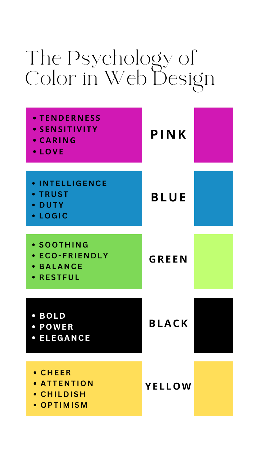
Red
- Draw the attention of your visitors.
- Use as an accent for attention in food, fashion, and marketing.
- Avoid overuse, not suitable for luxury or professional websites.
Yellow
- Bright and cheerful, symbolize happiness and optimism.
- Use sparingly to energize or create a joyful atmosphere.
- Be cautious with shade to avoid a cheap or spammy feel.
Orange
- Energetic and vibrant, associated with fun and enthusiasm.
- Ideal for drawing attention to actions, sales, or content.
- Use judiciously to prevent overwhelming visuals.
Green
- Harmonizing and calming, associated with growth and nature.
- Suitable for science, tourism, and environmental topics.
- Less appropriate for luxury or tech-focused content.
Blue
- Linked to dependability and trust, popular in corporate settings.
- Ideal for health care, technology, and legal fields.
- Be mindful of darker shades to avoid a cold atmosphere.
Purple
- Conveys luxury and creativity, associated with wealth and authority.
- Use dark purples for luxury, and light purples for spring and romance.
- Avoid using it for attention-grabbing, as it tends to be soothing.
Brown
- Warm and natural, stimulates the appetite
- Suitable for real estate, finance, and background designs
- Use it thoughtfully, as it can be perceived as conservative.
Black
- Strong and sophisticated, associated with elegance and authority.
- Suitable for luxury goods, fashion, and marketing.
- Avoid overuse, as it can be overwhelming or perceived as menacing.
White
- Associated with purity, cleanliness, and safety.
- Great for healthcare, high-tech, and science sites.
- The effect depends on other colors in the design; versatile for various websites.
Color Differences by Gender
Color psychology works on both genders in different ways. If a female finds something attractive, that doesn’t mean, the male eye also attracts it. Therefore, website owners should tailor their website designs to cater to their specific target audience.
Men are more likely to buy products when prices are displayed in red because they believe innately that red prices are associated with savings.
On the other hand, according to a survey, women dislike orange the most, whereas men have an aversion to brown. Both genders show a preference for the color blue, with 57% of men and 35% of women favoring it.
Suppose your website is about cosmetics so as a web designer, you should know that women select colors that are not too harsh. As they will want to avoid colors that are seen as cheap.
Final Thought
In Conclusion, the significance of color in web design cannot be overstated. It is an important tool to communicate with the world and grow your business. The design of a website itself is an important aspect of founding trust.
Since 94% of users do not trust poorly designed websites and leave without taking action, designers strive to understand the psychology of colors to implement and comprehend it from a human perspective. Although each color has its meaning, this article aims to help you differentiate them.